
Add a tooltip component to Phoenix
This post will show you how to add a custom tooltip component to your Phoenix project that uses the PopperJS library.
You can view all the code in a simple project on Github. See a diff from the initial install at 922ecca..30e278a
This post wil also demonstrate how to incorporate any Javascript library that requires bindings to an element. In Phoenix that is done through Hooks.
The Component
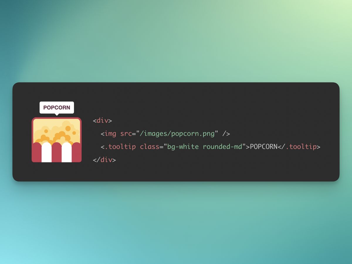
In the CoreComponents module, we have a tooltip component. I have defined a class attribute to allow style overrides, but with a defaults of nil so it’s not required
I have also defined a slot which will take the content of the tooltip. The HTML of the tooltip is just a div element. This element has the phx-hook attribute which tells Phoenix which set of hooks to bind this element with (more under Javascript).
Every element that is bound with hooks requires an id. Because we need to use tooltips easily, I have added a random ID generated through a random_id/1 function. The function takes a prefix just to help avoid collisions, even though we're using random bytes. The end result looks like this <div id="tt_F3P5wcGhyQA"…
defmodule PhoenixTooltipsWeb.CoreComponents do
  # ...
  attr :class, :string, default: nil
  slot :inner_block, required: true

  def tooltip(assigns) do
    ~H"""
    <div id={random_id("tt")} class={["tooltip", @class]} role="tooltip" phx-hook="TooltipHook">
      <%= render_slot(@inner_block) %>
      <div class="arrow" data-popper-arrow></div>
    </div>
    """
  end

  def random_id(prefix) do
    prefix <> "_" <> (:crypto.strong_rand_bytes(8) |> Base.url_encode64(padding: false))
  end
  # ...
end
The Live View
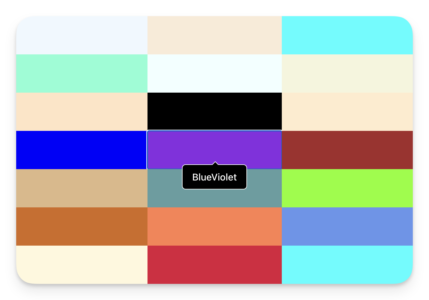
Every demonstration needs a contrived example. Here I am producing a grid of HTML colours using the HTML standard colour names. The block is a colour and the tooltip is the name of the colour.
defmodule PhoenixTooltipsWeb.PageLive do
  use PhoenixTooltipsWeb, :live_view

  def mount(_params, _session, socket) do
    {:ok, assign(socket, :color_names, color_names())}
  end

  def color_names() do
    [
      "AliceBlue",
      "AntiqueWhite",
      "Aqua",
      #...
      "BlueViolet",
      #...
      "WhiteSmoke",
      "Yellow",
      "YellowGreen"
    ]
  end
end
The Heex template iterates through all the colour names and adds a button (so you can see the tooltip on focus/blur) with the colour as the background and a tooltip with the colour name as it’s text.
<div class="grid grid-cols-1 sm:grid-cols-2 md:grid-cols-3 lg:grid-cols-4">
  <%= for color <- @color_names do %>
    <button class="h-16 rounded-none" style={"background-color:#{color}"}>
      <.tooltip class="px-4 py-2 font-medium text-white bg-black border border-white rounded-md">
        <%= color %>
      </.tooltip>
    </button>
  <% end %>
</div>
The CSS
The CSS is almost directly from the PopperJS tutorial.
The .tooltip class (included in the component by default) is initially set to display:none and then, when given the data-show attribute, is set to display:block. The rest is the styling of the arrow and it’s position.
.tooltip {
  display: none;
}

.tooltip[data-show] {
  display: block;
}

.tooltip > .arrow,
.tooltip > .arrow:before {
  position: absolute;
  width: 8px;
  height: 8px;
  background: inherit;
  border: inherit;
  border-bottom: none;
  border-right: none;
}

.tooltip > .arrow {
  visibility: hidden;
}

.tooltip > .arrow::before {
  visibility: visible;
  content: '';
  transform: rotate(45deg);
}

.tooltip[data-popper-placement^='top'] > .arrow {
  bottom: -5.5px;
}

.tooltip[data-popper-placement^='bottom'] > .arrow {
  top: -5.5px;
}

.tooltip[data-popper-placement^='left'] > .arrow {
  right: -5.5px;
}

.tooltip[data-popper-placement^='right'] > .arrow {
  left: -5.5px;
}
The Javascript
The first step is to install the PopperJS library via npm. the --prefix assets is needed to place the node related files in the assets/ directory.
$ npm install @popperjs/core --prefix assets
I have created a Tooltip javascript class to manage the lifescycle of the tooltip. This can be pasted into the top of your app.js file or in it’s own file and imported into app.js
The constructor sets up the tooltip by creating a popperInstance, linking the tooltip element to it’s parent, and setting event listeners on the parent to show/hide the tooltip. For this example we are using mouseenter and focus to show the tooltip and mouseleave and blur to hide it. The class also stores destructors so that event lsiteners are removed when the tooltip is removed from the DOM (preventing possible memory leaks).
import { createPopper } from '@popperjs/core';

// A class to manage the tooltip lifecycle.
class Tooltip {
  showEvents = ['mouseenter', 'focus'];
  hideEvents = ['mouseleave', 'blur'];
  $parent;
  $tooltip;
  popperInstance;

  constructor($tooltip) {
    this.$tooltip = $tooltip;
    this.$parent = $tooltip.parentElement;
    this.popperInstance = createPopper(this.$parent, $tooltip, {
      modifiers: [
        {
          name: 'offset',
          options: {
            offset: [0, -8],
          },
        },
      ],
    });
    this.destructors = [];

    // For each show event, add an event listener on the parent element
    //   and store a destructor to call removeEventListener
    //   when the tooltip is destroyed.
    this.showEvents.forEach((event) => {
      const callback = this.show.bind(this);
      this.$parent.addEventListener(event, callback);
      this.destructors.push(() =>
        this.$parent.removeEventListener(event, callback)
      );
    });

    // For each hide event, add an event listener on the parent element
    //   and store a destructor to call removeEventListener
    //   when the tooltip is destroyed.
    this.hideEvents.forEach((event) => {
      const callback = this.hide.bind(this);
      this.$parent.addEventListener(event, callback);
      this.destructors.push(() =>
        this.$parent.removeEventListener(event, callback)
      );
    });
  }

  // The show method adds the data-show attribute to the tooltip element,
  //   which makes it visible (see CSS).
  show() {
    this.$tooltip.setAttribute('data-show', '');
    this.update();
  }

  // Update the popper instance so the tooltip position is recalculated.
  update() {
    this.popperInstance?.update();
  }

  // The hide method removes the data-show attribute from the tooltip element,
  //   which makes it invisible (see CSS).
  hide() {
    this.$tooltip.removeAttribute('data-show');
  }

  // The destroy method removes all event listeners
  //   and destroys the popper instance.
  destroy() {
    this.destructors.forEach((destructor) => destructor());
    this.popperInstance?.destroy();
  }
}
Phoenix Hooks are where the magic happens.
Our TooltipHook listens for three of the six possible lifecycle hooks.
-
mountedis called when the tooltip has been added to the DOM and this is where we instantiate an instance of our Tooltip class and link it to the element. (this.elis made available by Phoenix). -
updatedis called if the element is updated by Phoenix and we simply pass on that message. -
destroyedis called when the element is removed from the DOM and we in turn calldestroyon theTooltipobject so that the event listeners are removed.
Important: You need to update the let liveSocket = … line in app.js and add , hooks: Hooks which is not there by default.
// ...
const Hooks = {
  TooltipHook: {
    mounted() {
      this.el.tooltip = new Tooltip(this.el);
    },
    updated() {
      this.el.tooltip?.update();
    },
    destroyed() {
      this.el.tooltip?.destroy();
    },
  },
};

// ...
let liveSocket = new LiveSocket('/live', Socket, {
  params: { _csrf_token: csrfToken },
  // add the Hooks object
  hooks: Hooks,
});
// ...
By using Phoenix Client hooks we are able to connect the element of a component to a Javascript client library, add event listeners, and provide custom interaction.
See all the code on Github.